As a type designer, I often return from a trip with more photographs of letters than of landmarks. It’s a habit that can sometimes make me seem slightly alien to the people travelling with me, although I’m sure many fellow type designers will recognize the feeling. Most of these images simply end up in my archives, waiting for an idea to emerge from them one day. Others are harder to forget. Long after the trip is over, they continue to raise questions and occasionally become the starting point of a genuine type design project. Calenza belongs to that second category.
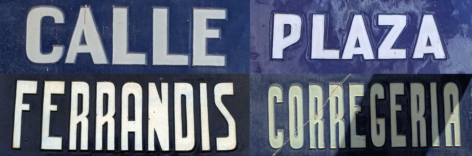
Looking back, I believe the project began during my very first days in Valencia. Among the many street signs scattered throughout the city, a particular series of blue ceramic plaques immediately caught my attention. They looked unlike anything I had encountered in other cities I had visited. Their presence, their striking contrast, and above all their lettering possessed a character of their own. I began photographing them, initially out of curiosity, then with the growing feeling that they belonged to a larger and remarkably coherent system. As the photographs accumulated, so did the questions. One, in particular, kept returning: what was it that made these signs feel so distinctive?
It was only later that I discovered these plaques were the result of a competition organized by the City of Valencia in 1902, with the goal of improving the visibility and legibility of street names. That detail immediately resonated with me. More than a century separates these signs from our screens, apps, and contemporary wayfinding systems, yet the underlying challenges remain remarkably similar: making information visible, making it easy to read, attracting attention without compromising clarity. At times, while studying these plaques, I had the feeling that their designers were grappling with many of the same questions type designers continue to face today.
These plaques are neither the oldest nor the most spectacular examples to be found in the city. Their design is relatively simple: white lettering set against a deep blue background. Made of glazed ceramic, the letters are molded in slight relief rather than simply painted onto the surface. This subtle depth changes the way the forms are perceived and gives the lettering a physical presence rarely found in contemporary signage.
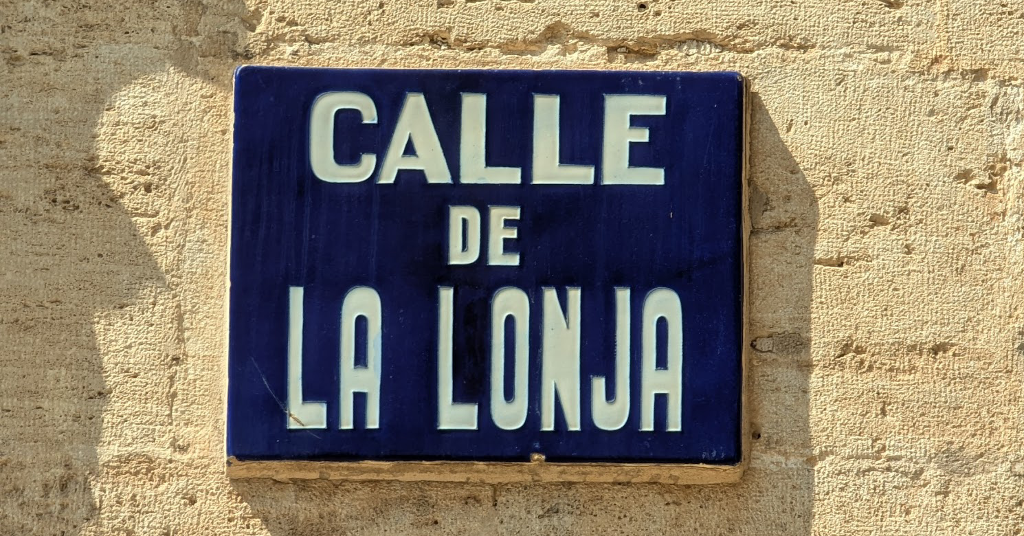
At this stage, I had no intention whatsoever of designing a typeface based on these plaques. The more I observed them, the more questions they raised. They seemed to belong to a common system, yet displayed remarkable variations from one plaque to another. Certain letters appeared again and again, while others subtly changed in shape or proportion. Behind them, one could sense a desire for consistency, but also a clear degree of human interpretation. Long before standardized production methods and digital typefaces existed, these plaques had been designed, modeled, and manufactured by craftsmen whose hand remained visible in the final result. It was this tension between consistency and variation that gradually became the true starting point of the project.
Compression as a tool for legibility
As I continued studying the plaques, another characteristic gradually caught my attention. It had less to do with the letterforms themselves than with the way they occupied space. Most plaques follow a relatively simple structure. The first line identifies the type of street — Calle, Plaza, Bajada — while the second line contains the street name itself. It is this second line that reveals something particularly interesting.
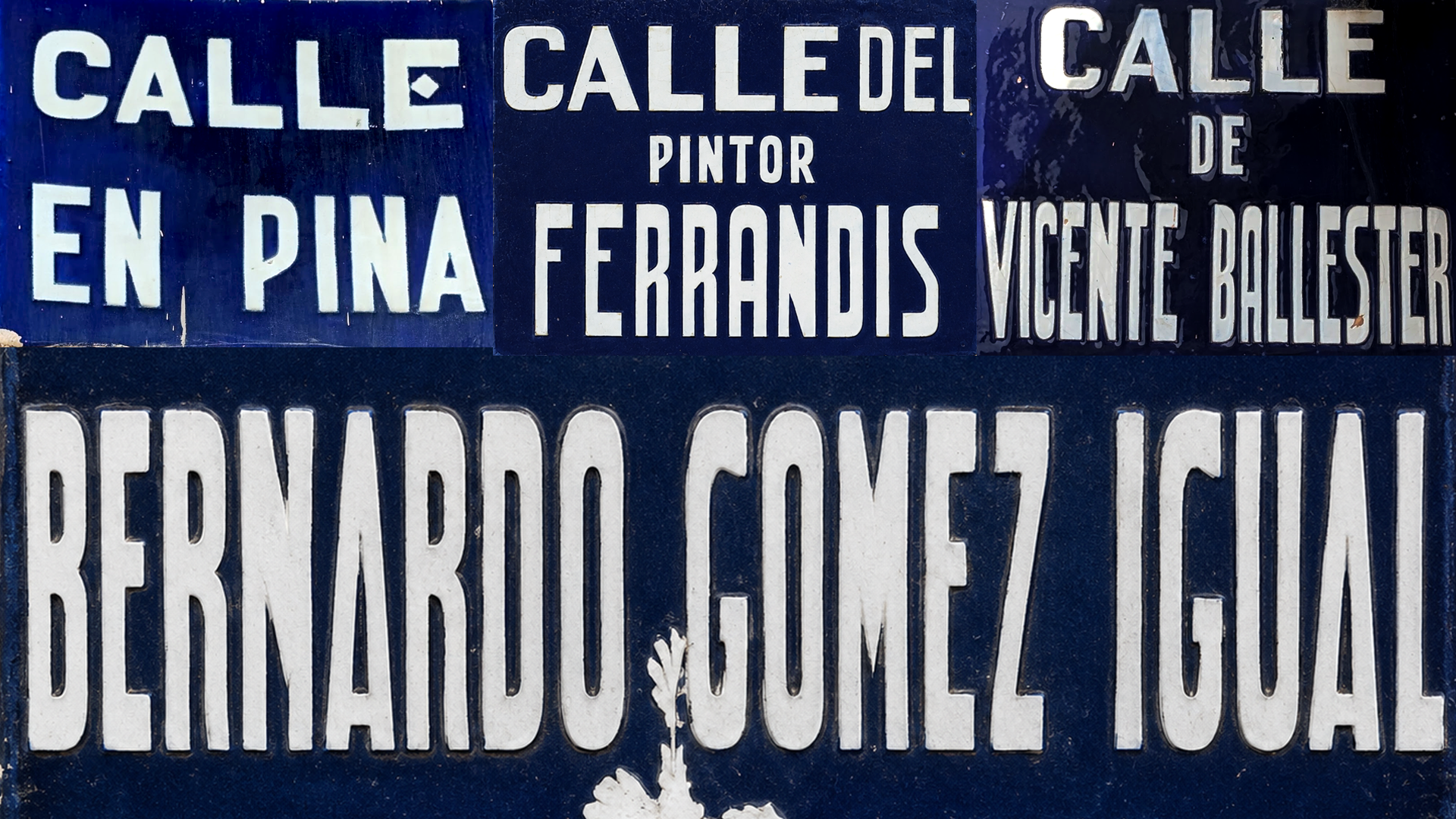
Valencian street names can vary considerably in length. Some plaques only need to accommodate a handful of letters, while others must contain much longer names. Yet the craftsmen behind these signs seem to have avoided what would appear to us today as the most obvious solution: simply reducing the size of the lettering.
Instead, they adopted a different strategy. The letters generally retain a generous height in order to remain clearly visible from a distance, while their width is progressively reduced as space becomes more limited. In some cases, the level of compression becomes so extreme that it noticeably affects readability. By narrowing the letterforms rather than reducing their size, the craftsmen preserved the visual presence of the street name while still fitting it within the fixed dimensions of the plaque.
While studying the plaques, I also noticed that this strategy sometimes reached its limits. Some heavily compressed inscriptions lose part of their readability and become more difficult to decipher at first glance. The craftsmen of the time seemed to be constantly balancing two competing constraints: keeping the letters large enough to remain visible from a distance while fitting occasionally very long street names into a limited space. The result was not always perfect, but it reveals the kinds of compromises inherent to any signage system.
This observation had a significant influence on the development of Calenza. The Condensed and Compressed styles were not created to satisfy a market demand or to artificially expand the family. Their origins lie in the plaques themselves. It is probably one of the most unexpected lessons I took away from this project. Beneath these seemingly modest street signs lies a thoughtful exploration of space, legibility, and proportion that still feels remarkably relevant today.
Building an alphabet from fragments
I couldn’t tell you exactly when the idea of turning these observations into a typeface first emerged. It was not a sudden decision. Instead, it developed gradually as photographs, notes, and research began to accumulate. Each plaque provided new information, but also raised new questions. Behind these letters, a graphic system was slowly beginning to reveal itself—far richer and more complex than I had initially imagined. What had started as a simple observation while walking through the streets of Valencia was gradually evolving into a fully-fledged type design project.
At first, I assumed it would be relatively easy to identify a complete alphabet. The reality proved far more complex. No single plaque contained enough letters to form a complete character set. One might provide an excellent R but no G. Another featured a remarkable S but no A. Each photograph added a new piece to the puzzle, yet never enough to complete it.
This process of collecting references quickly turned into a genuine exercise in cataloguing. Letters were extracted, sorted, and compared. Gradually, a corpus began to emerge. It would become one of the most important documents of the entire project, as it was from this collection that the real design questions started to appear.
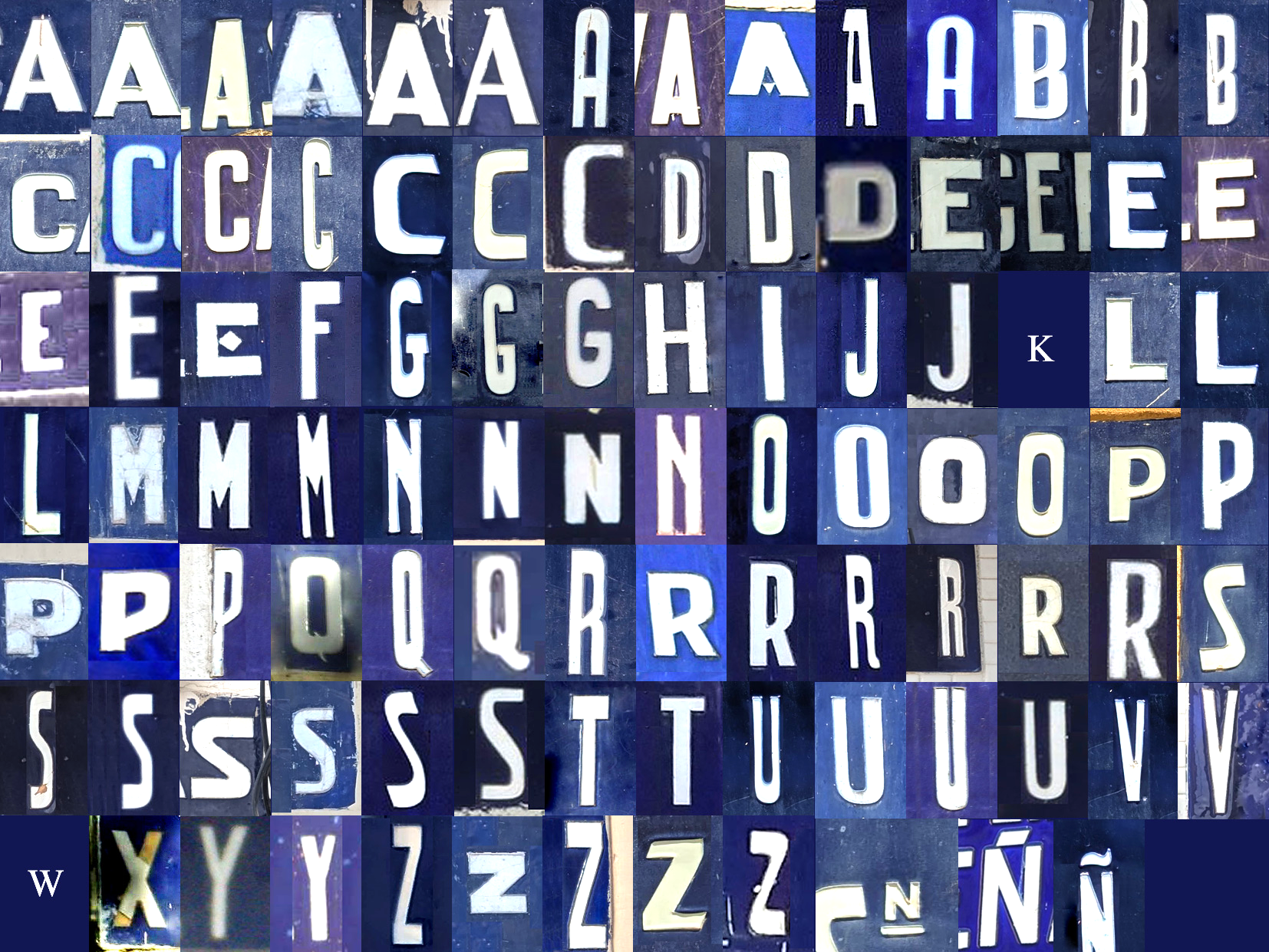
When looking at a single plaque, the eye naturally reads it as a typeface. Everything appears to belong to a coherent system. But once all the letters are brought together on a single sheet, that impression quickly begins to fade. There is no single A. There are several. The same is true of the R, and many other characters. Some letters differ only slightly in proportion, while others reveal much more substantial variations.
This discovery completely changed the way I approached the project. I was not looking at an alphabet that simply needed to be digitized. I was looking at a collection of variants that had to be understood, interpreted, and organized. The challenge was not so much to reproduce the plaques themselves as to identify the underlying principles that connected all of these different forms.
Finding the system behind the variations
As the corpus continued to grow, certain patterns began to emerge. Despite the differences from one plaque to another, the letters shared a common construction logic. Their proportions were generally narrow. The counters remained simple and open. Endings favored direct, geometric solutions. Even when individual details varied, the overall character of the lettering remained instantly recognizable.
The real challenge was determining which forms should become the reference. Every decision involved a choice. Should the most frequently occurring version of a letter take precedence, or the most distinctive one? Should the priority be the internal consistency of the system, or the preservation of some of the irregularities that gave the plaques their unique personality? These questions would ultimately shape the direction of the entire project.
Projects like this constantly require a balance between fidelity and interpretation. A literal reproduction would have resulted in something static, unable to function in contemporary contexts. An interpretation that was too free, on the other hand, would have erased the very qualities that made these letters so distinctive. The challenge lay in finding the right position somewhere between those two extremes.
Drawing what didn’t exist
Most of the plaques I studied used capitals exclusively. A few numerals and occasional punctuation marks appeared here and there, but the system was essentially limited to uppercase letters.
It was at this point that the real design work began.
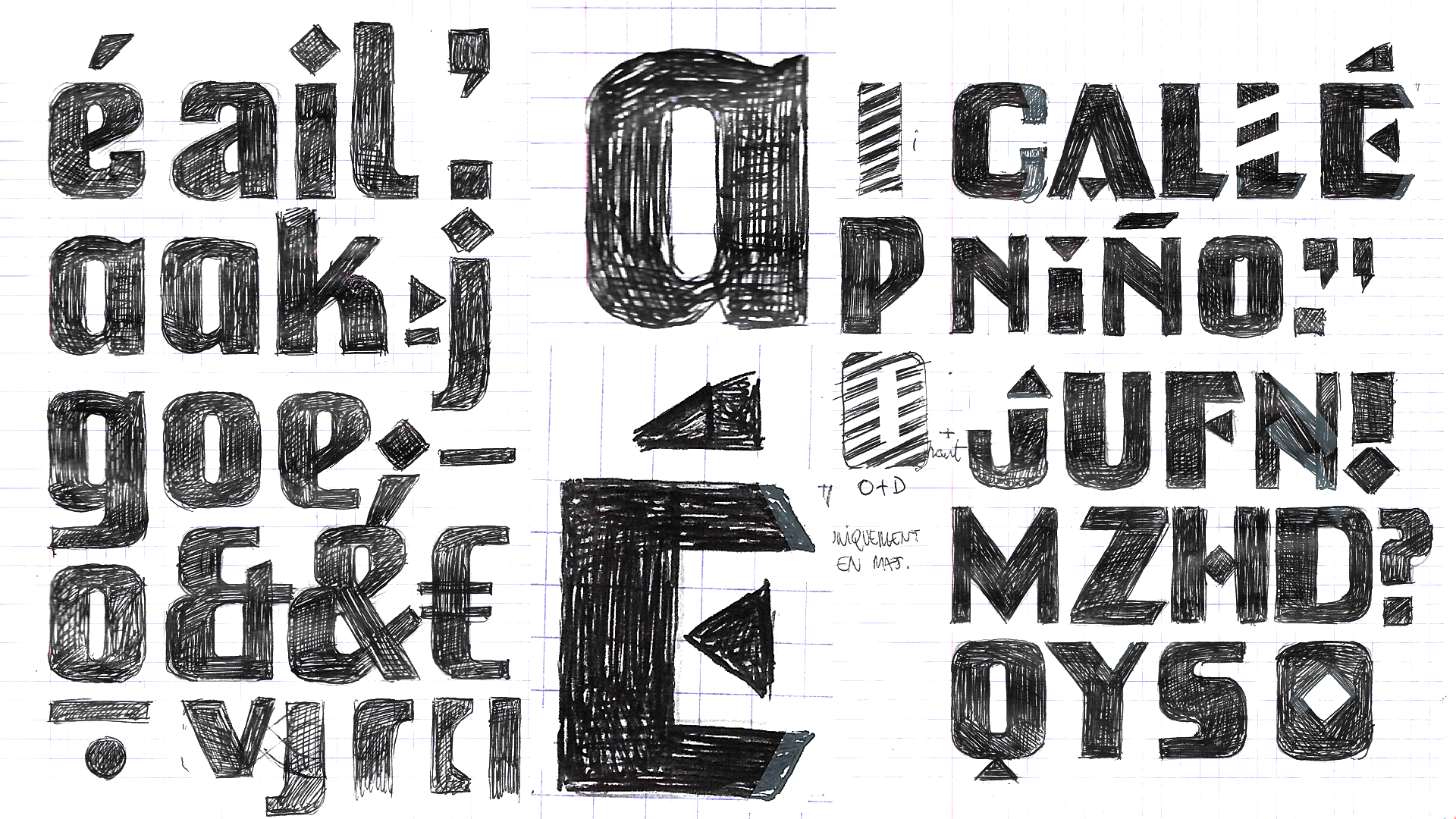
The plaques provided clues, but they did not provide a typeface. They offered a visual language, not a complete character set. The lowercase letters had to be invented. The punctuation had to be designed. Accents and diacritics had to be developed. Every form that was absent from the original material had to be imagined while remaining faithful to the spirit of the source.
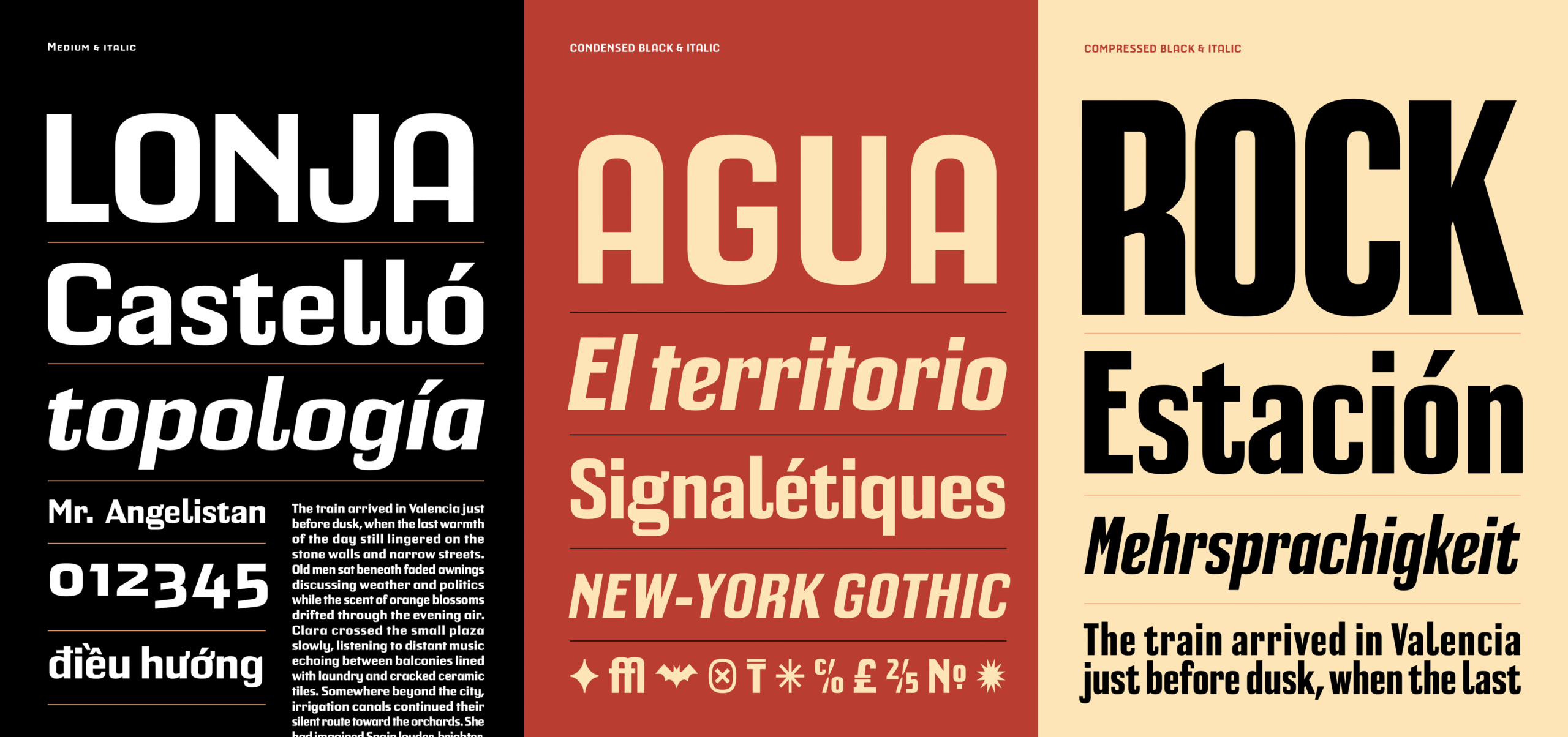
The different widths of Calenza: Normal, Condensed, and Compressed
This phase required a great deal of experimentation. The earliest sketches explored a variety of possible directions. Some sought to extend the principles observed in the capitals as directly as possible. Others introduced a greater degree of flexibility in an effort to improve readability in continuous text. The most appealing solutions on paper were not always the most viable in practice. Some ideas produced highly expressive words but became problematic when tested in real-world applications. Others worked perfectly well in a handful of languages, only to reveal their limitations as soon as the project expanded into more complex linguistic systems.
Preserving the exceptions
As the research progressed, several plaques revealed letters that seemed to belong to an entirely different family. Some variants featured particularly expressive or unexpected solutions. In certain cases, they appeared on a single plaque and then vanished completely from the rest of the corpus.
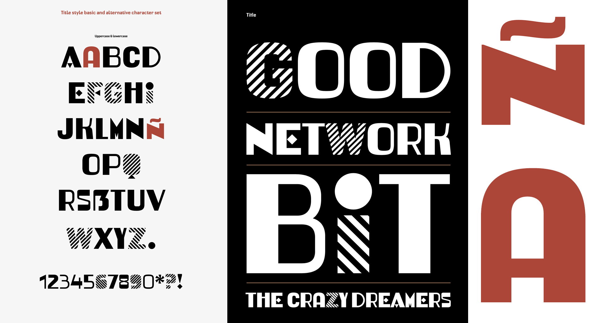
These forms were too interesting to ignore, yet too distinctive to be incorporated into the core system without disrupting its overall balance. Rather than setting them aside, I chose to give them a dedicated space of their own. This decision gradually led to the creation of Calenza Poster. The style brings together the most expressive forms discovered during the research and preserves part of the vernacular vocabulary that might otherwise have been lost. It is not a decorative addition, but a natural extension of the project itself—a way of preserving the exceptions without compromising the coherence of the whole.
Beyond the Revival
Although Calenza draws its inspiration from early twentieth-century street plaques, the goal was never to create a historical reconstruction. The plaques served as the project’s starting point, not its final destination. It quickly became clear that the family needed to function in contemporary contexts as well. The different widths developed throughout the project, together with the expressive possibilities offered by the Poster style, gradually opened up applications that extend far beyond urban signage.
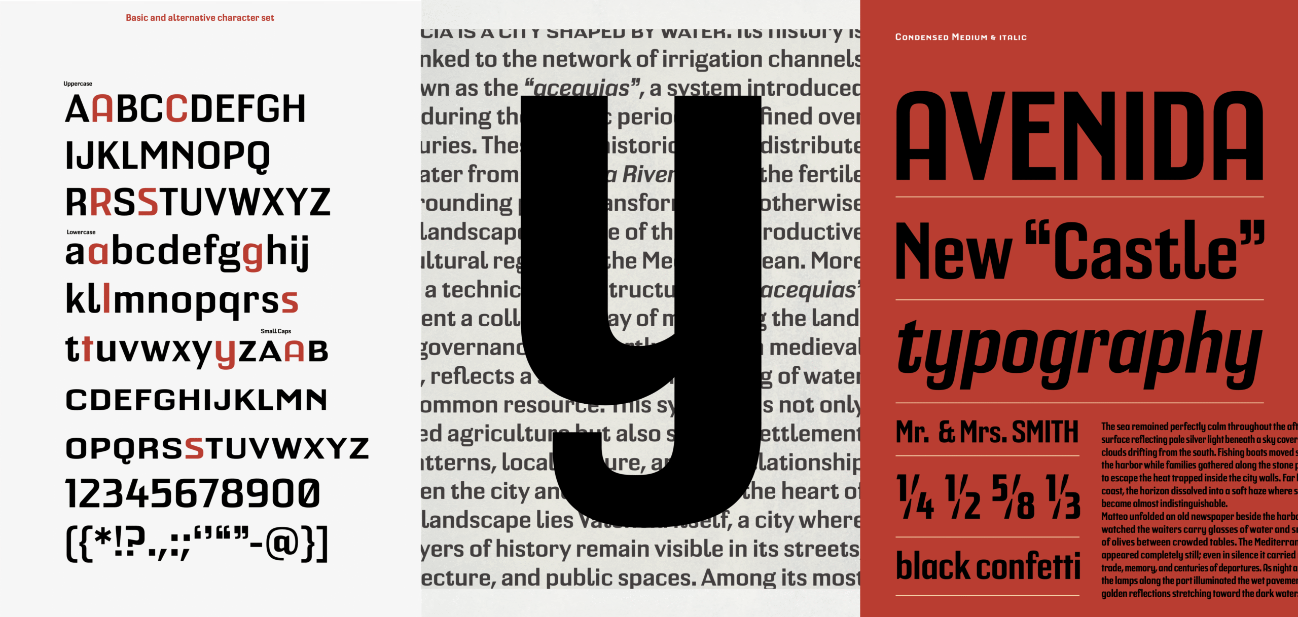
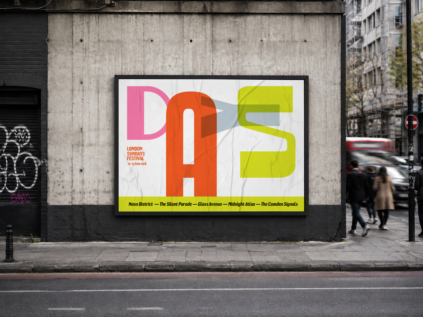
An example poster combining the different styles of Calenza.
I particularly enjoy the idea that a form once observed on a street plaque can find a new life in a completely different environment. A visual identity, a cultural poster, a wayfinding system, or even a digital product can offer these letters possibilities they could never have imagined in their original context. To me, this is where the value of a contemporary revival truly lies. It is not simply about preserving historical forms. It is about allowing them to continue evolving, finding new relevance and new directions within contemporary graphic design.
Looking back, Calenza is not the reproduction of any single plaque. It is the result of a process of reconstruction, one that I continue to find immensely rewarding. The street plaques of Valencia provided the original fragments: letters, proportions, details, and sometimes even contradictions. The role of the type designer is to transform those fragments into a system capable of functioning in the present.
This project reminded me that type is not always hidden away in rare books or buried in the archives of a type foundry. Sometimes it can be found a few feet above the ground, on the corner of a street, quietly waiting for someone to take the time to look up.
Photos by Olivier Gourvat. Thanks to Amara Peachy for the additional photographs.