When I created this geometric font family in 2009, I never thought that Sofia Pro would be so popular with designers, web designers, creatives and international companies who use it daily for their communication projects. I would like to thank these professionals for your interest in this font family and the importance you attach to using professional fonts for your projects.
Since the beginning of its creation, I have always taken into account the feedback from users and their uses on different media such as web, print, apps or ebooks. This feedback has allowed me to make this font family evolve considerably with the addition of new languages, new OT features, a complete kerning set (with more than 8000 pairs)…
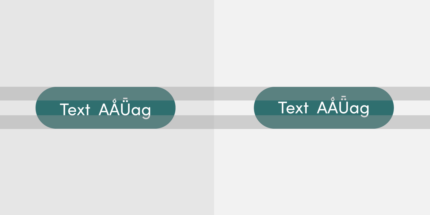
Since last year, many UX designers had given me feedback on the vertical alignments of the font that were not optimized for the design of text buttons, 2-line framed titles, etc. These designers wanted improvements on the vertical font metrics. I also wanted Sofia Pro to meet these requirements of the web design professionals with a completed optimization.
Why the web button texts seemed off-centre
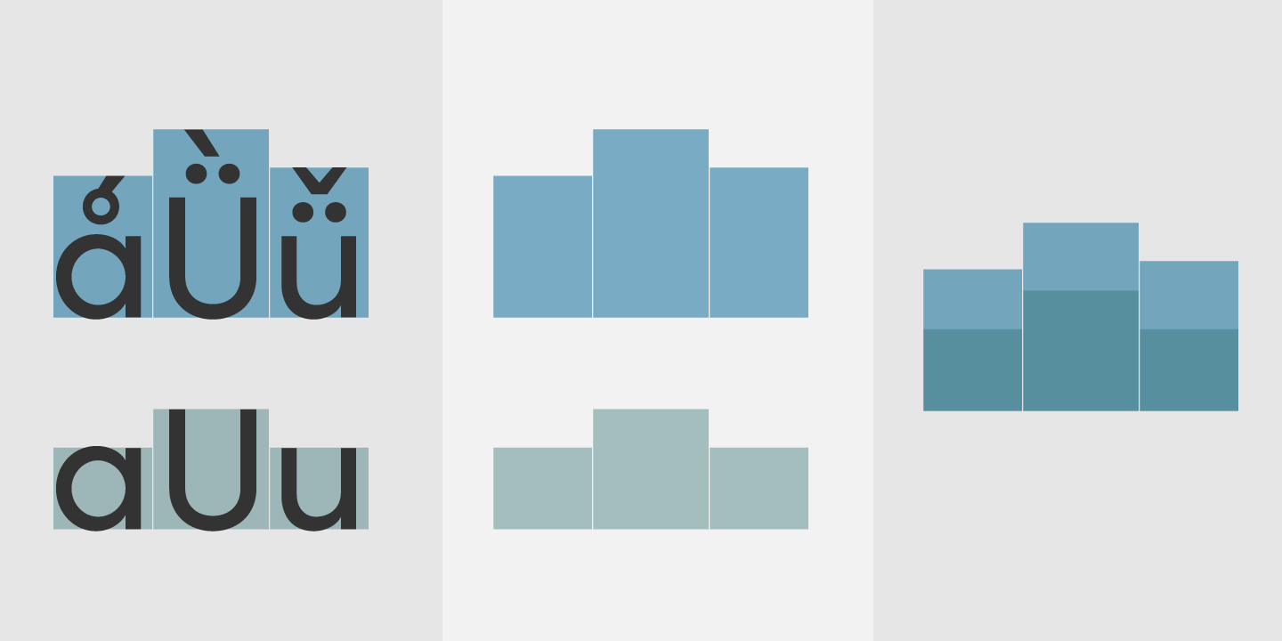
Sofia Pro’s vertical alignment is, since the first versions, optimized for print and the metrics took into account the 140 languages that contain different accent heights like /Aringacute/ or /Udieresismacron/. The glyphs were (numerically) correctly aligned but the alignment perception for languages without accents could appear vertically off center due to a very large box height that must contain all the glyphs of the font.
A metrics update with a web strategy
With the synthesis of the feedback, I updated these alignments with a web-oriented alignment strategy with alignments optimized for UX design. I won’t go into the details of the different alignment figures in this latest version but here are some illustrations that speak for themselves. Graphic designers will have the same alignments as before.
What to do if it still doesn’t suit you?
In spite of all the importance I have given to this new version, some UX designers prefer to manage the various alignments of a font themselves. Two solutions are still possible:
• Use the numerous CSS functions to align as you wish the texts of the web buttons, the framed titles, etc.
• Optimize these alignments globally with online tools like Fontsquirrel (https://www.fontsquirrel.com/tools/webfont-generator) which will allow you to define your own vertical metrics. Be careful, however, to have a user license and respect our final EULA. This version is now available from all the font distributors we work with. Thanks again to use Sofia Pro and thanks for your patience.
Special thanks to Axel Corjon for his help and contribution to the development of the new Sofia Pro metrics.